Finally, I Can Sleep.

Portal is now skinned, so for the most part the aesthetics going into the Republic are done.

Sophie’s finally made her appearance! Although I must say, being black and white doesn’t exactly strike the eye as much as a colored version will. Keep refreshing to see all her… err… flavors.

As for the logo, well, if someone can make us a 800×100 pixel banner (or 800×150 pixels at the most), well, that’d be grand.

Sembreaks sure do give you lots of time to finish your stuff.

From Software Wants You!

…to fill out a survey. Supposedly it’ll help determine the flavor of future games. This is the first time I’ve ever actually seen them make an effort to make their “listening” visible.

Go here to fill out the form.

Note that the above link is already the Google Translated version. The original version, if for some reason you really want to go to it, is here.

First spotted by Thinimus, I believe. Credits to him. See his thread on RH for more details.

Still reading? Stop. Go on, click the link and do your part. You know you want to.

You get a nice shiny wallpaper for it, so go on!

Pure and Honest Rawk

Sorry J.E., but I’m sticking to being a fan of Mozy. I mean good lord, this guy (or girl) is the master of digitally painting ACs. You said it before: the movement, the depth and the drama is there. Not to mention some good old-fashioned brush techniques.

If you’ve never seen him/her paint, then you’re missing out on a LOT. That’s no understatement. Even if you’re not a hardcore Armored Core fan.

So as an act of public service and overall do-good-ing, here, a sample of the artist’s talent.

Hungry for more? If you want to do the rest of the stuff justice you’ll look at each one and watch how they come to be.

Mozy, if you’re reading this and don’t like being pimped, just shoot me a quick email and I’ll quickly turn this post into happy-land links instead. If you’re not or you do, then the world is a much better place.

Zzz…

Back in (Soon to Be) Black

Now this is what I’m talking about.

Lightning fast load and refresh speeds, a centralized database, and some nice new software to go along with it.

Yep, this is version 3 alright.

Everything’s still not back up, but yeah, I took it all with me when we switched over. No content was lost, don’t worry. As of now the only major things missing are the pictures from the gallery.

First things first, you should know that this is NOT going to be the default skin. No way am I calling baby blue and white “default.” It’s going to be black. And if you haven’t spoiled the surprise for yourself yet by not looking at my teaser pics from ages ago, I think you’re going to like it.

Well, I hope. Sophie’s bound to make an entrance somewhere there, so watch for it.

Second, those damn quote tags are giving me nightmares. Some of them didn’t make it across the conversion process intact, and are now bleeding their HTML contents all over the forums. They’re like an infestation of humongous proportions. Here, have a look if you don’t believe me. Again, if you have the power to fix them (i.e., you’re the poster or are a mod), please do. It’s just a matter of editing the post, and putting the text in between orderly quote tags. Yeah, just like from before.

Third, about your avatars. Don’t be surprised if they get taken down, as our forum no longer resizes any pic you put in into the allowable dimensions. ‘Di na kayo baby. If you really want an avatar you’ll resize it to 150×150 or smaller, and like it too.

Fourth: a chat module that actually works. From here you can see which people are in there, so hopefully if you see one lonely guy or girl you can join them and talk about the soft underbelly of the Internet or something.

Ah well, after talking about this for the longest time, it’s nice to see it finally come to fruition. Didn’t come at the best of times, but hey, necessity is the mother of site updates (yes, it really is!).

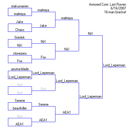
PACT 2.1 Results

Man, this is massively overdue. But hey, we all know by now what the results were anyway, so this is kind of just a formality.

A great many thanks to our gracious hosts, NiX and maitreya.
A great many thanks to all those who came and participated as well.

The PACT just keeps getting better and better. The contestants were arguably better this time around, and there was greater variety in the designs. Maybe it’ll grow even more in the future, but only time will tell that for now. In the meantime, enjoy the results.

pact2_1

A repeat of history, as some said. Pictures are available here.

Sega Going Full Force on AC4

Alright, so we can all stop Google Translating the Japanese AC4 site, because Sega (who, for those who still do not know, are now publishing the game – no more Agetec) just released their version.

Have a quick look around there, and notice the Engrish that’s been present since Armored Core 2 is still lingering in the metal-flavored air. Overed Boost? C’mon.

Tanking!

Finally found one. Guppy vs. Azure Knight (both from ACO).

Holy hell. I’ve never seen a tank that quick.

Some quick points I noticed:

* The grrreat number of AP you get (well, in comparison with the other ACs of this generation anyway).
* Near infinite flight.
* Turning speed is no longer a problem.
* You have the choice of going aggro or defensive at any point in the match.
* Bigger weapon payload, and possibly more ammo to go with it.

Systems Engaged

The official weblog of the Raven Republic is now online! Yey! Yey!

This is where we’ll keep updates and announcements from now on, although important stuff will be reiterated inside the forums themselves. This shall also serve as the new front page of the site, as you’ve probably noticed by going to this URL.

On the lighter side of things, the rumblings of a PACT II can be heard just over the horizon. Summer? Maybe. :D

That’s it for now people. I’m out.